3d Earth with Rotating Animation with CSS
A friend of mine suggested me to do some animated planet stuff with CSS. I gave it a go and ended up with a kinda-cool animated planet Earth.
A friend of mine suggested me to do some animated planet stuff with CSS. I gave it a go and ended up with a kinda-cool animated planet Earth. I had this one in my local playground as yet, but today I’m going to share it online right here.
Before going any further, I want to tell you that I have made it look like 3d-earth and used CSS3 keyframes for the rotating animation. You must see the demo before we jump into the code mess.
The Concept of CSS Earth
This idea demands a realtime rotating sphere, which is not possible in CSS. But a lookalike is doable, all you need is to throw some CSS ingredients into a div and there you go.
For animation, I’ve used a small CSS keyframes trick that makes it appear lively and rotating.
HTML
It’s just a single div, trust me.
<div id="earth"></div>Will play with :before and :after of #earth in the next section to add some detailing.
CSS
Now comes the important part, the styling.
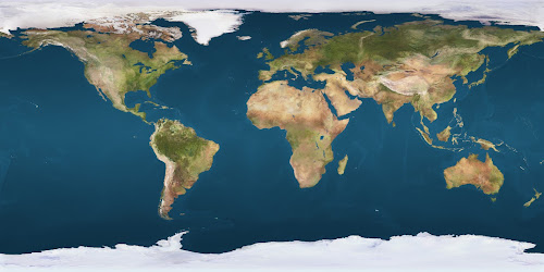
I added some width and height to #earth, and then gave it a background-image similar to flat earth map. Here’s the small preview of our flat earth map I found on the internet.
Our #earth is relatively positioned. To make it appear spherical, I added a 50% of border-radius.
Explanation
Detailing of our earth as a 3d object has been done in 3 layers which is covered below step-by-step with some CSS code snippets.
-
Setting up the baseline and some
box-shadowplay with the#earthitself (mainly for the shadow on the right)#earth { /* [1] Allow it to contain the absolutely positions pseudo-elements (later-on) */ position: relative; /* [2] Set-up the dimensions and spacing */ width: 300px; height: 300px; margin: 3em auto; /* [3] Prepare the animation effects */ transition: transform 200ms linear; animation: rotate 4s linear infinite; /* This is going to be defined in the next step */ /* [4] Tweak the appearance, and give it a nice background i.e. the world map */ color: #000; border-radius: 50%; background: url(path/to/world-map-image) 0 0 repeat / 630px; box-shadow: inset 20px 0 80px 6px rgba(0, 0, 0, 1); /* [5] Position things in a 3d space */ transform-style: preserve-3d; } -
Again applying box-shadow in
#earth:beforefor the shadow on left#earth:after { /* [1] Break the flow to show this as an overlay */ position: absolute; top: 0; left: 0; /* [2] Make it take all the space available in the box (ahem... globe!) */ width: 100%; height: 100%; /* [3] Make sure this has no generated content, as we want this just for fancy purposes */ content: ''; /* [4] Give it some shape and shadow */ border-radius: 50%; box-shadow: -80px 15px 80px 10px rgba(0,0,0,.9) inset; } -
Finally applying some CSS3
radial-gradientto the background of#earth:afterto give our earth a spherical finish#earth:before { /* [1] Again, break the flow to show this as an overlay */ position: absolute; top: 0; left: 0; /* [2] Again, give it all the available space */ width: 100%; height: 100%; /* [3] Duh. */ content: ''; /* [4] Add some shape and overlay effect to it */ opacity: .2; border-radius: 50%; background: radial-gradient(circle at 100px 100px, #fff, #000); }
The :before and :after of #earth are absolute positioned, and carry same height, width and border-radius as the main element.
I’ve fixed the background-size of our earth to 630 pixels to fit the image perfectly inside our #earth. I come up with this number after a number of adjustments.
The Animation
Now comes the animation part. Our earth map image is very wide. Our #earth element is of 300x300px, hence it shows earth map under 300x300px only.
Now if we linearly move our background from 0 to 630px of horizontal position, we can give #earth a rotating animation effect. I’ve implemented this with the help of CSS keyframes.
@keyframes rotate {
  0% {background-position: 0 0;}
  100% {background-position: 630px 0;}
}
If you put everything together, preview below the results you’ll be getting.
On the demo page, I’m using a background image for the body to make the environment look like space, just a few stars repeating over-and-over-again as you can see in the background.
I wanted to add curved and blurred edges to our earth but that’s not doable with the technique I followed – as far as I know.
Hope you enjoyed this article. Let me know your thoughts on this. Cheers!
Written by Rahul C.
Founder and curator of W3Bits. Have questions, suggestions, or anything to say about this post? Reach out on X or send me an email.