Creating a Responsive Pure CSS Masonry Layout
The CSS-only way to create masonry layouts. Easy to understand, simple to implement. Demos included.
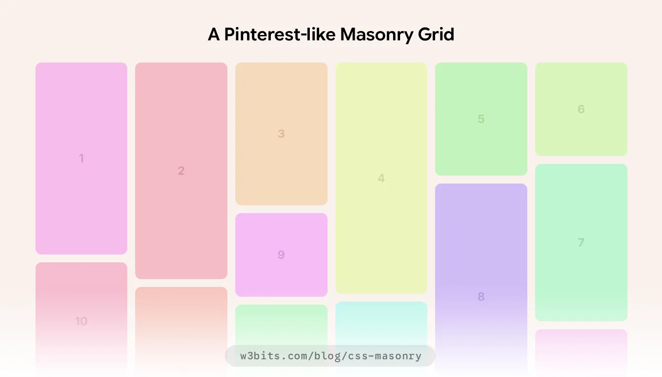
Pinterest, one of the first adopters of masonry-based layouts, relies heavily on JavaScript to render a left-to-right masonry grid.
Let’s take a leaner approach and create a masonry layout using only CSS, without a single line of JavaScript.
Understanding Masonry Layouts
Imagine an exposed wall of bricks. That’s exactly what a masonry is in real life, exhibiting two common brick-laying patterns:
- Horizontal: Traditional left to right flow with varying brick widths
- Vertical: Waterfall-like top to bottom flow with variable brick heights
In this guide, we are going to create a vertical masonry, which is everyone’s favorite out of the above two patterns.
We will first implement the masonry using the most stable technique to make it compatible across all the browsers. Then, we’ll enhance it with a modern soon-to-be stable way.
HTML structure
Keeping things simple, let’s follow a wall’s anatomy to prepare our markup for a simple masonry layout:
- The bricks: Individual masonry-items with variable heights
- The wall: A masonry-container holding all the bricks or items together
- The joints: The common gutter or gap between masonry items, handled by CSS on the presentation side
<div class="masonry-container">
  <div class="masonry-item">...</div>
  <div class="masonry-item">...</div>
  <!-- More masonry items -->
</div>
This structure will stay consistent with the two methods that we are going to cover in the rest of the article.
Column-based CSS Masonry
A little preface
When Pinterest went viral in 2011-12, I tried creating its lookalike with CSS floats, inline-blocks, table properties, and what not. I ended up with equal-height columns, which was definitely not a masonry.
Nothing worked until I found CSS columns. I contributed the outcome of this experiment to a WordPress plugin later, which was a small hit back then.
Interestingly, the CSS multi-column layout module is around since the time when Pinterest was launched (2011). The module facilitates presenting blocks as part of multiple virtual columns.
Senior developers consider CSS columns the simplest way to instantly set up a stable and functional masonry layout with zero JavaScript overhead.
Let’s verify that by breaking down the masonry construction into some actionable steps, which are as follows:
The column-count base
Applying column-count allows you to add a specific number of adjacent columns to any block-level element. The column-gap property can add specified uniform space between these columns.
The child elements inside the block get aligned as per the specified number of columns, which gives an effect of a masonry layout.
Here’s a simple mobile-first setup where our masonry defaults to 1 item per column for small screens:
.masonry-container {
  --items: 1;
  --gap: 1rem;
  column-count: var(--items);
  column-gap: var(--gap);
}
Managing values with custom properties keeps things well-organized and flexible too, which we’ll see in action in the upcoming sections.
'Reset' for consistency
If you aren’t already, consider using a CSS reset to make things look consistent across different browsers. Start with this universal reset.
Fixing the gap between items
The column-gap property adds gaps only between the columns and not the grid items. Let’s add --gap as bottom margin to each item to create a uniform separation between them.
.masonry-item {
  margin-bottom: var(--gap);
}
Making it responsive
Currently, our masonry defaults to 1 item per column. Let’s extend it for bigger screens and adjust column-count according to our layout needs.
/* 48rem = 16 * 48 = 768px */
@media (min-width: 48rem) {
  .masonry-container { --items: 2 }
}

/* 64rem = 16 * 64 = 1024px */
@media (min-width: 64rem) {
  .masonry-container { --items: 3 }
}
Avoiding Cell-breaking
With CSS columns, child elements (masonry items in this case) may split across columns when rendered on the screen. We can avoid this issue completely using the break-inside CSS property:
.masonry-item {
  break-inside: avoid;
}
And there’s our vertical masonry ready to use (demo here), which isn’t perfect but functional and works well if item hierarchy is not a concern.
What's odd?
If you see the outcome, you’ll notice that our masonry items are arranged in a top-down fashion inside every column.
You should expect this behavior from CSS columns, as they simply divide a given element into virtual columns and don’t really control how the contents are arranged.
Accessible Left-to-right Masonry with Grid Lanes
The column-based approach will appear to be a bit too simplistic, especially when you expect your masonry’s items to flow from left to right.
It forces readers to scan vertically within each column rather than following a natural left-to-right flow.
Let’s address that with Grid Lanes display property, which is expected to be the default way in the future to implement a horizontal masonry.
What about CSS Grid's native masonry?
The Firefox-only grid-template-rows: masonry approach doesn’t work anymore. It was dropped by CSSWG in favour of CSS Grid Lanes.
Supported in Safari 26.4+, Grid Lanes are also available as an experimental feature in Chrome and Firefox.
Make sure to enable Grid Lanes in your browser before proceeding.
Setting up the grid
The setup resembles CSS grid, as Grid Lanes are part of the CSS Grid module. Set display: grid-lanes and configure column template and gap just as you would with CSS Grid.
.masonry-container {
  --items: 1;
  --gap: 1rem;
  display: grid-lanes;
  grid-template-columns:
    repeat(var(--items), 1fr);
  gap: var(--gap);
}

@media (min-width: 48rem) { .masonry-container { --items: 2 } }
@media (min-width: 64rem) { .masonry-container { --items: 3 } }
Automatic columns without media queries
You may skip media queries by letting the Grid Lanes decide the number of columns for you based on the available container width.
.masonry-container {
  --item-width: 10rem;
  --gap: 1rem;
  display: grid-lanes;
  grid-template-columns:
    repeat(auto-fill, minmax(var(--item-width), 1fr));
  gap: var(--gap);
}
Column-based Masonry as a fallback
If you are planning to stick to CSS for masonry layouts, it’s a good idea to implement it with CSS columns first, and then build on top of it with Grid Lanes using the @supports directive:
@supports (display: grid-lanes) {
  .masonry-container {
    display: grid-lanes;
    column-count: initial;
    column-gap: initial;
    grid-template-columns: repeat(var(--items), 1fr);
    gap: var(--gap);
  }

  .masonry-item {
    margin-bottom: initial;
  }
}
Here’s the final demo that uses column-based masonry as the base and extends it to the experimental Grid Lanes approach.
The generator also supports Tailwind CSS and all the major JavaScript frameworks. You can customize, colorize, and preview the masonry, and download the code for free.
In Conclusion
To sum up, we created a CSS-only masonry with column properties and extended it with experimental Grid Lanes for browsers that support it.
Share this guide if you found it useful. And as always, I welcome your thoughts, questions, and suggestions either via email or X/Twitter.

Written by Rahul C.
Founder and curator of W3Bits. Have questions, suggestions, or anything to say about this post? Reach out on X or send me an email.